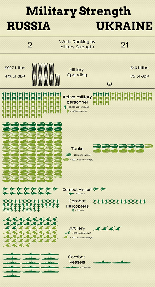
I couldn’t find an infographic that I thought truly showed the difference betweeen Russia and Ukraine’s military capabilities without just hitting you with numbers, so I made my own (hi-res version if you click). It reminds me of a really one-sided game of Risk (never mind Russia’s nuclear abilities). But I also think that visualising data in this fashion really highlights certain things. This graphic got me thinking about military spending. Russia spent $90.7 billion (4.4% of its GDP) on its military in 2013, compared to Ukraine’s $1.9 billion (1.1% of GDP in 2012) – and this supposedly represented a 24% increase in spending for Ukraine. So $90.7 billion buys you the second most powerful military in the world, while $1.9 billion buys you the 21st most powerful military. There is an enormous drop off in spending between “superpowers” and the rest of the world – and if even $1.9 billion, which seems like a relatively small sum in comparison, still gets you a fairly decent military, then what is military spending like in the rest of the world – and what are these superpowers spending their billions on, exactly?
Tomorrow this infographic will be used as part of a more relevant post.